
It seems like a silly question, doesn’t it? Lockdowns are intended to reduce infections and that they do so may seem intuitively obvious. Maybe they are less effective than claimed or intended and are not worth the costs. But increase infections? Surely not.
However, an intuition that is inadequately tested against observations is just another name for a prejudice. As I learned in a brilliant, motivational, undergrad lecture introducing me to social science more than fifty years ago, the social value of social science chiefly lies in its ability to root out false intuitions/prejudices and replace them with something in greater conformity to observable realities. So, let’s put some beliefs about the effects of Lockdown to the test.
Infections are not observed and are not realistically observable. What we have are a series of indicators from which the time pattern of infections might be inferred: cases, hospitalisations, deaths. Each comes with its own limitations and all come with a lag: they are records of events that are consequential on infections in the past and they become available some time after those infections have happened.
Those lags pose major problems for public policy in a context where events are moving very rapidly. The speed of change is exemplified, for example, by the UK Government’s Covid dashboard, which on 23/11/2020 headlined an estimate of ‘R’ in the range of 1.0 – 1.1, accompanied by the statement that cases were growing at a daily rate of 0% – 2%. Beneath the headline could be found the then latest estimate of the (past) 7-day rate of growth in infections. It was minus 22.9%. You could, accurately, say that the website authors were somewhat ‘behind the curve’.
Covid ‘cases’, i.e. tests yielding a positive, are the statistics nearest in time to the infections that give rise to them. They come with numerous limitations, but I have always thought that they can at least serve as useful indicators of the evolution of the epidemic over time. For example, in the UK the official cases numbers stand well below estimates of new infections derived from other methodologies, such as those used in the ONS’s weekly surveillance report or in the ZOE app’s symptom reporting system. Yet all three systems of measurement/estimation find a similar time profile for the epidemic.
On a day-by-day basis the cases data are noisy, inter alia being subject to the vagaries of the testing and reporting systems in play, but some clear patterns can be observed nonetheless. It is these observable patterns in the data that contain the information required by policy makers who seek to look forward, not backwards.
One of the patterns is a consistently low reading in the date-of-specimen data (relative to other days of the week) for Sunday cases. We have reasonable sight of why that is so. Many of the Covid tests are conducted at home and involve both the postal receipt of a testing kit and the return of the sample taken, but the postal service quietly sleeps on Sundays and recipients of the kits are advised not to post them on that day. That tends to induce test-kit recipients to perform the tests either before or after a Sunday (and the weekly spike in cases found in the date-of-specimen data for Mondays suggest it is mostly the latter).
It can be inferred, then, that Sunday cases are more tilted toward people who have turned up at testing centres on that particular day of the week. We might guess that these people are more symptomatic than average, but, if so, that bias is of little consequence if the aim is to understand the time profile of the epidemic’s evolution: there is no strong reason for thinking that the proportion of infections that turn out to be more symptomatic varies greatly through the course of a contagion. So long as like is being compared with like, in similar ways though at the different times, the signals should be reasonably reliable.
There is clearly a trade-off in working with a highly-reduced dataset of Sunday observations only. It takes out a lot of noise in the daily data and greatly reduces and simplifies the analytic load (allowing me, in a few hours, to conduct an essential exercise that has been neglected by a whole state apparatus over a period of more than eight months). On the other hand, it does set aside large numbers of observations that can also be expected to carry relevant information. It is therefore appropriate to make at least some checks that the data reduction does not seriously mislead, although more comprehensive assessment exercises must necessarily be left to those with the resources to carry the greater burdens.
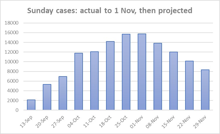
The Sunday date of specimen data, starting from the first Sunday on which the weekly ‘low’ appears clearly in the data record of the Autumn epidemic in the UK, is shown in the first chart below.

As can be seen, the data follow the classic pattern of the upswing of an epidemic curve: cases rise quickly, then the rate of growth slows and the curve turns. This is what the epidemiological models tell us to expect to happen and it is what we have observed to happen in curves from around the world.
The eye is drawn to the rising numbers in the chart, but it is the less obvious curvature that is exhibited which contains the clues as to the future evolution of cases.
Given the reduced dataset, it is comforting that the implied curve becomes flat between Sunday 25October and Sunday 1 November. The ONS surveillance study (much the most direct measure of new infections that we have) puts peak infections sometime in the week ending 25 October. Since cases tend to lag infections by several days, that is consistent with a peak in cases in the week defined by these two Sundays (the peak of an epidemic is characterised by a zero slope in the daily infections curve). The consistency between two very different assessment exercises suggests that nothing of major significance (for current purposes) is being missed by working with a reduced dataset (of Sunday observations).
The observed data pattern can be projected forward to generate a counter-factual in which there was no Lockdown (announced on 31 October, implemented on 5 November). UK government ‘scientific’ advisors have consistently based forward projections on an assumption of sustained exponential growth in cases over the near future. However, the data in the chart above do not follow such a pattern and starting from an assumption that is falsified by the evidence has led only to nonsense.
In developing a data-consistent projection, I am going to work with logarithms of the cumulative cases data corresponding to the eight measurements in the chart. This takes us back to the sort of curve that was much examined at the beginning of the Spring epidemic. These graphs showed cumulative deaths as a function of time on a logarithmic scale. They are still to be found on sites like Worldometer and Our World in Data. The ‘cumulative’ curves go ever upward, but, past a certain point (which, empirically, is to be found at an early stage of the Covid epidemics around the world), they flatten as they rise.
The reason for working with logarithms is that it facilitates examination of the curvature pattern in the data and, as already indicated, it is this curvature that contains the clues as to the possible future evolution of the epidemics. It is a perhaps remarkable finding of fact that the rate of growth of cumulative cases/hospitalisations/deaths declines with time over almost the entire lifetime of an epidemic. It is a bivariate relationship between a growth rate and time that is amenable to estimation from a relatively limited data set. Moreover, study of this type of relationship has been going on for more than two centuries in a range of different contexts.
Thus, in the early nineteenth century, a London actuary, William Gompertz, sat down with a whole set of mortality tables and found that a very simple relationship between the growth of cumulative deaths and time could provide a decent summary of the various, different records. Gompertz’s proposition was that the rate of growth of cumulative mortalities was a negative exponential function.
Now read on, keeping the next chart in mind. It shows a closely associated relationship (not quite the same as Gompertz’s) for the pre-Lockdown Autumn Covid epidemic in the UK.

The negative relationship is there to see. It is something that SAGE/PHE have never focused on or utilised, even though attention was drawn to it at the beginning of the European epidemics by a Nobel bio-physicist, Stanford’s Prof Michael Levitt, based on his own, early study of Wuhan data. Subsequently, Prof Levitt has mentioned Mr Gompertz quite a lot, but, for his labours he has suffered the intellectual ostracism familiar to truth-tellers through the ages.
The irony is that, whilst SAGE/PHE have been eager beavers when it comes to projecting positive exponentials out into the near future, the idea of projecting a negative exponential (or, indeed, anything going downwards) appears to be an anathema, a heresy that challenges the Party Line. Positive exponentials are scary things (Good), negative exponentials are not (Bad).
Looking at the data in the growth chart, any fitted trend is going to be heavily affected by that first observation. It is the most distant from the time period of interest (the four Lockdown Sundays), occurring at a relatively early stage of the Autumn epidemic when smaller numbers of cases were liable to cause greater volatility in growth estimates. On a judgment call, I will omit it for the purposes of the required counterfactual exercise, whilst noting that the effect of that omission will likely be to increase the counterfactual projections that follow below and, relative to a strict data read, bias things in favour of finding Lockdown effects that are more benign. It’s the sort of judgment call whose wisdom can be tested out ex post.
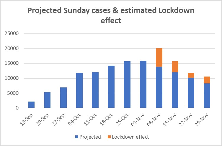
That (dropping the first observation) done, the next steps are to fit an exponential trend to the remaining data (as an approximation) and to use projection of that trend to estimate future growth rates. Moving back from logarithms to daily case numbers then yields the profile for Sunday cases shown in the next Chart.
The four numbers, for the Sundays of 8, 15, 22 and 29 November are the counterfactual estimates of the evolution of the Autumn epidemic in the Lockdown period. That is, they are estimates of what things could be expected to look like, if the Lockdown decision had not been made and the government had continued to rely on pre-existing policy.
The general shape is a familiar one: the curve goes up, turns and then goes down. The Autumn wave curve for Switzerland, a country that has not introduced a national lockdown, looks like this, albeit that the epidemic there has been more intense and the Swiss peak is more sharply defined (more Matterhorn than Cross Fell).
Data for the actual out-turns for first two Sundays in Lockdown are already available in finalised or near finalised form and these are included on the next Chart, showing both the counterfactual projection and the deviation of the actual out-turns from it (the orange bars). It points to Lockdown having an initial, upward impact on cases. The upward impact is of quite substantial magnitude.

Given the relatively unfavourable conditions in which the virus is now attempting to spread, it can be expected that this initial impact effect will wash out over time, and the second of the orange blocks indicates that this is already happening. An interesting corollary, which arises from the ‘overshoot’ estimated to have occurred on account of the Lockdown policy, is that the post-peak rate of decline in cases can be expected to be unusually fast. The washing out of the overshoot adds to the ‘natural’ downward momentum of a contagion in retreat.
As indicated at the beginning I expect that many will find these results counter-intuitive, but the numbers are as the numbers are. It is natural though to ask whether there are any plausible explanations for them. That is beyond scope here, except to say that intermediate micro-economic theory can give a plausible account as to how and why the identified, unintended consequences could have occurred (it’s to do with the economics of the choice of timing for consumption and leisure activities) . As a corollary of that, it cannot be said that, though unintended, the outcomes were unforeseeable. Some did indeed foresee them and drew attention to them as a likely negative consequence of Lockdown. As challengers of Groupthink, they were simply unheard, that’s all.
For those in authority it is an uncomfortable fact that a large research literature on the effects of regulation indicates that unintended consequences are near ubiquitous and that, not infrequently, those consequences turn out to be the opposite of what was intended, or at least it is claimed was intended, for the measures imposed. For anyone steeped in that research base nothing in the above should come as a surprise.
The above exercise cannot be read as definitive (nothing in science is), but I hope it will stimulate further work, not least by government advisers. The critical first step is that to recognise that a foundational exercise in this type of assessment work is to develop reasoned counterfactuals that can be substantiated on the basis of whatever evidence is available, however limited that is. Absent that, all claims about the effects of this or that policy are little different from muttering gollum, gollum, gollum. Members of Parliament and members of the public are right to expect more than that from our Government.
Postscript
The above was written in November 2020, before reliable case data were available for the 22nd and 29th November. It was subsequently updated in Twitter posts to include those two dates, yielding the Chart below.
At the time of updating, the increased, positive effect on cases (the orange bar) for 29th November was something of a puzzle. However, it coincides almost precisely with an unexpected upturn in hospital admissions whose potential significance seems to have flown well above the heads of most commentators. Looking back, the most obvious explanation is the increasing, national spread of the UK’s Kent variant of the virus, about which the public and the WHO were only informed on 14 December, even though it has been subsequently revealed that it was a major presence in Kent as early as October 2020.
In November 2020 policy and media attention was heavily focused on the Lockdown measures and it appears that a real and present danger, which did not fit into the preferred narratives of the time, was largely ignored.
